You may have heard people say; “System fonts are boring!”, “System fonts suck!” and “Never use system fonts again!”.
While the standard way in which PowerPoint displays ‘system’ fonts might be perceived as boring, it would be cheap to say your presentation will always look bad if you use Arial or Times New Roman. A good designer should be able to work with these fonts just as they would have to work with a customer’s CI font. A presentation with Arial can look better than some overly-designed presentations with their fancy-schmancy custom fonts.
There is another problem with custom fonts, and that is embedding them into your presentations. There are a few ways and hacks to do this (not going to discuss that here), but what you should know; is that none of them is perfect and fault-free .
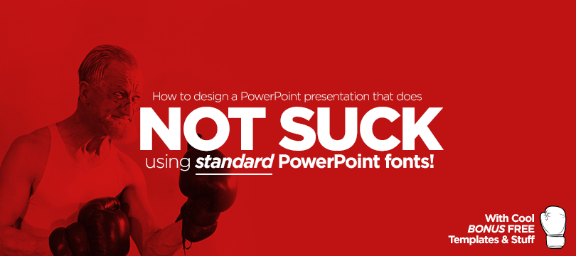
So let’s look at ten techniques to make system fonts look beautiful and make your presentation NOT SUCK.
BONUS: Includes an editable PowerPoint template with samples.
1. Letter Spacing and Line Spacing should never be standard
Setting the letter spacing, (known as ‘tracking’ in professional typography) is the first opportunity to make your system fonts look beautiful.
Standard letter spacing is designed to work best across all scenarios. That includes all sizes, left, right, center and full justified, headers, blurbs, bold, italic and so on. In your presentation, you don’t use all those options.
Generally speaking, we reduce the spacing more for bigger sizes (bringing the characters closer together), and we leave it standard on really small fonts (about 7pt-9pt). This wil make your copy more readable – by improving the flow between every character because there is less negative space to interrupt the flow.
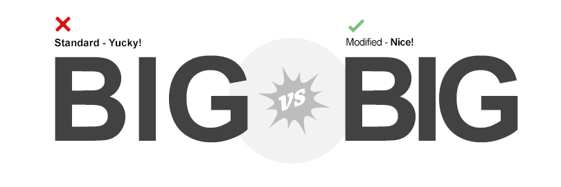
You can also occasionally increase the spacing to create a sense of symmetry, but this will make the text less legible.
The standard spacing options that PowerPoint provides (Tight, Loose, etc.) often feels inadequate because it either makes the spacing too much or too little – so here is how you set your own spacing values:
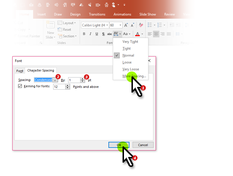
- Make Sure you are on the Home Ribbon and click on the letter spacing drop-down and select “More Spacing”
- Select ‘Condensed’
- Select a value between 0.5 to 3pt – Smaller font sizes are closer 0.5pt and bigger ones are closer to 3pt
- Click on ‘OK’ to confirm your values
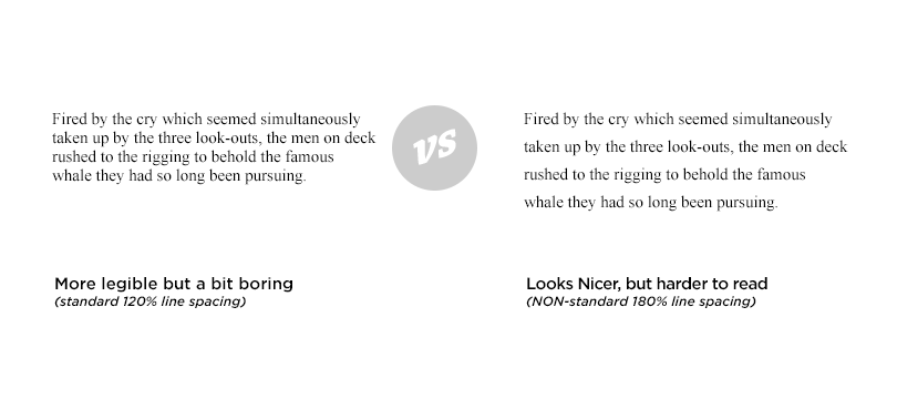
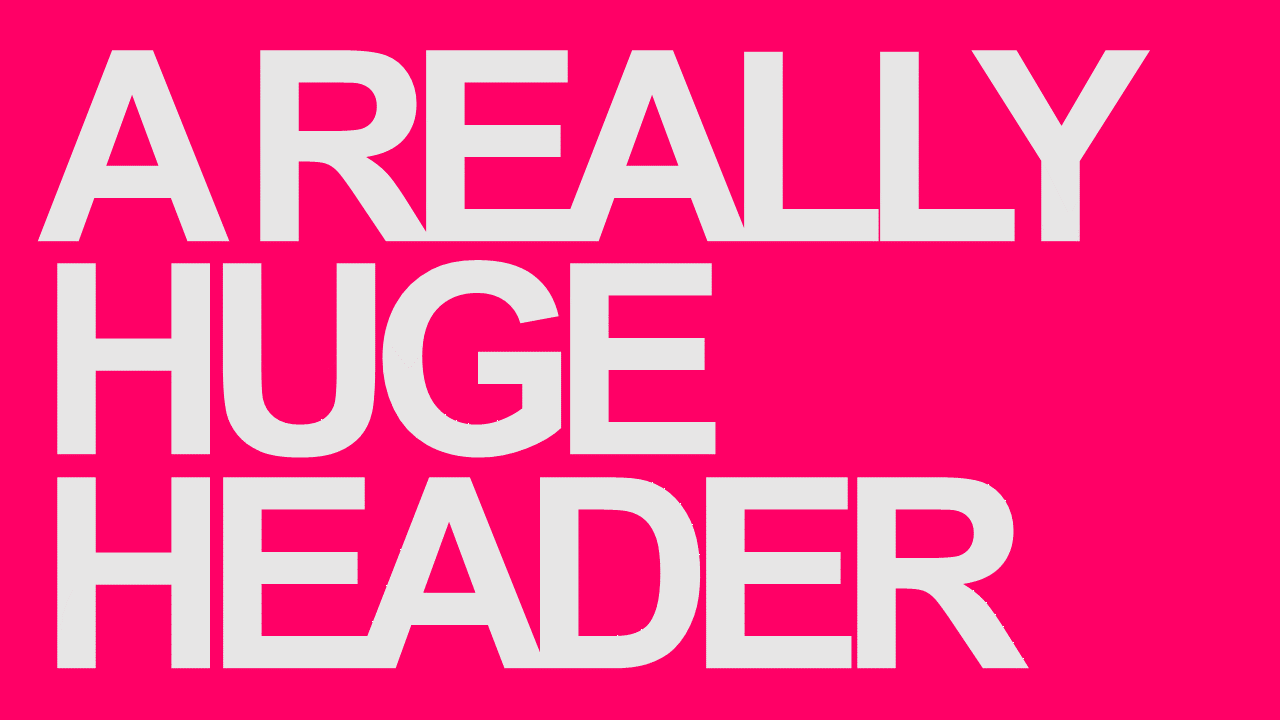
Adjusting the line spacing (known as ‘leading’) will help your content flow. The standard leading is typically 120% of the font size. A good test is to read your body or header a few times and see how easy it is for your eye to find the next line. Sometimes going beyond the standard 120% makes your body content look elegant, but might decrease legibility. With really big headers it looks better when there is almost no line spacing to interrupt the flow.
Note: The majority of fonts have proportional spaces set between each character. There are fonts that have the same space between them, they are called ‘monospace’ fonts and are rarely used – because they tend to be less legible.
2. Not all font sizes are created equal
Most fonts have an optimal size for legibility. This is the size at which the font is the most legible – but not necessarily the sexiest. For Arial, it is 12pt although it is also very legible at 10pt. Arial Bold looks a little like Helvetica at really small and really big sizes with the right letter spacing. Times New Roman looks best at its optimal size which is 10pt.
Note: Serif fonts are generally considered more legible/readable than sans-serif fonts in paragraphs.
3. Font pairing with system fonts
Pairing Fonts is a skill – much like composition, color, and layout. There are a few ‘made-up’ rules you can find on the internet but in the end, you can make most fonts in the right proportions work with each other.
Mixing Times New Roman with Arial can look this Good?

Georgia looking hot with Tahoma!

What about two of the most hated fonts of all time, Courier and newbie Calibri?

Most people have never heard of Corbel and,… just look at it!

Trebuchet is actually one of my favorite system fonts, so this one was too easy.

Time New Roman with their serif friend Garamond for a lighter Italic

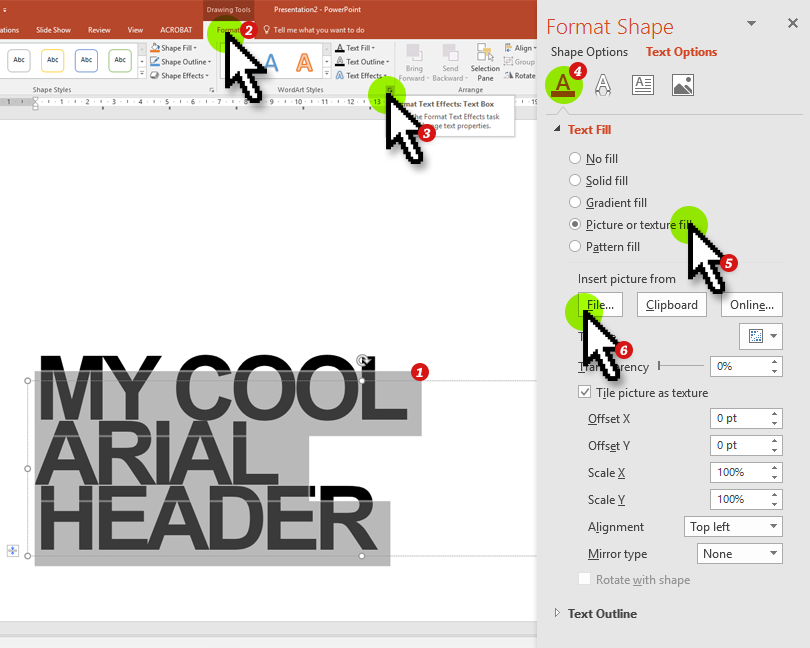
4. Textured Fills Transform Your Headers

Filling your headers with an image texture can make it look more like a design element. Typically the thicker the font, the better it looks filled. It works pretty well with a big bold Arial header and is easy to do.
- Select the text you want to texturize
- Click on the Format Ribbon
- Open the Format Text Effects Side Panel by clicking on the little arrow in the corner
- With Text Options Still active, click on Text Fill and Outline
- Select Picture instead of Solid Fill
- Click on File and Browse for your texture
- Typically it stretches the picture to fill the text, so you need to select the ‘Tile picture as texture’ checkbox and tweak some of the other settings.
5. Making text look more luxurious with negative space (also called white space)
Most people (even some graphic designers) struggle to understand the importance of negative space.
Firstly; the more ‘space’ there is – the more ‘luxurious’ a page looks because white space translates as effortlessness and flow.
Secondly; The reason we call it negative space is because it shapes the geometry and grid on your page. If there is too little or no negative space there isn’t any shape or composition for your eye to interpret. No way to distinguish between what is important and where to begin looking.
Finally; When something looks over-crowded (and over-designed), it looks like there was a struggle – like it was difficult to articulate your point and the flow is shrouded.
Bonus Tip: Squint your eyes until everything on the page starts to feel a little blurry to see what shapes are created by the negative space?
6. Readability Legibility
At KnockoutPrezo, we make a distinction between legibility and readability. Legibility is making it easy to recognize the individual characters in your text. Readability is creating an ‘eagerness’ to consume your text.
So what the heck does this have to do with making system fonts beautiful?
You can play with letters to make them interesting and not boring. Turn your text into graphic elements rather than headlines. This might make your text less legible but more fun to the consumer.
You could have a title screen that only has text on and is cool and fun to look at and keep in the background while you prepare your audience for the section you are about to present.
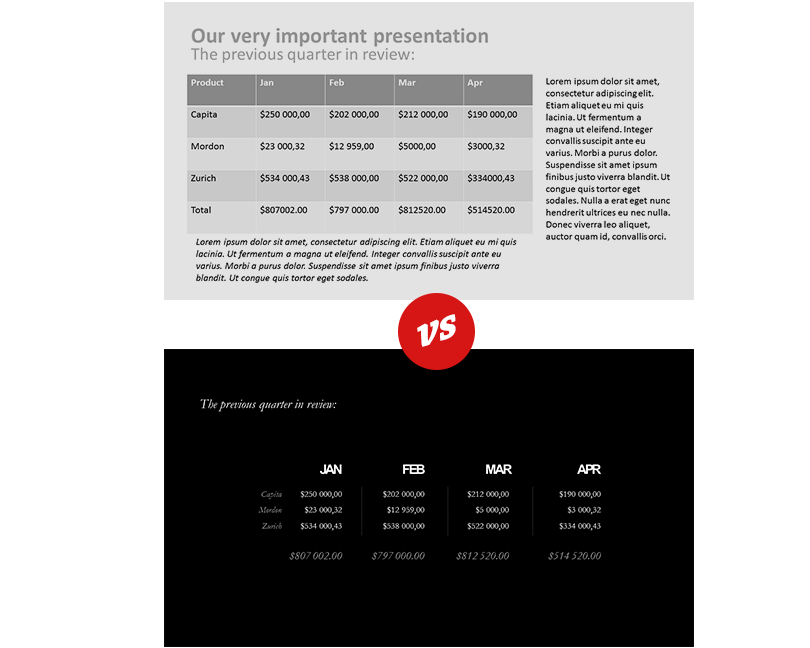
7. Focus on good layout rather than fancy ‘shmancy’ fonts
Custom fonts often distract from the real problem; poorly designed slides.
Great layout usually means you have good composition and the first step to great layout is a grid.

A grid is essentially a blueprint for your content. A grid determines what your master template will look like. You want to keep things consistent because you don’t want your audience to re-evaluate all the visual information on every slide such as your footer, where your headers and body is placed, and so on.
There are exceptions to this rule, but for the most part in financial or venture capital presentations when you are trying to avoid angst you should stick to this idea of a grid.
You also need your grid to be reusable, so there it is a ‘balancing act’ to consider between too much freedom and too little.
8. Darken your whites and lighten your blacks
A quick trick to make your text and pages look a bit more ‘natural’ by reducing the contrast a little and making the content a little less boring. Instead of using 100% black and 100% white – reduce the white to a very faint gray (about 10% black) and making your black text about 80% black.
Bonus Tip: Add a bit of blue in your black for a richer black feel.
9. Play with contrast
Use bright colors with dark text and vice-versa will help your headlines pop! You can also reduce contrast with really big text to create a wallpaper effect.
10. Great fonts that you didn’t know are system fonts
There are some pretty awesome system fonts that you can use besides Arial, Helvetica and Times New Roman too:
- Rockford
- Century Gothic
- Tahoma
- Segoe UI
Additional sources
See all the PowerPoint system fonts with previews and when to use them (Updated with Microsoft PowerPoint’s hot NEW 2020 font sets)
https://knockoutprezo.com/presentation_tips/official-list-of-approved-powerpoint-system-fonts-for-pc-and-mac-with-previews/
Fonts that are included with every version of Windows
https://en.wikipedia.org/wiki/List_of_typefaces_included_with_Microsoft_Windows
https://support.microsoft.com/en-us/kb/2121313
Fonts that are included in Mac OS X
https://en.wikipedia.org/wiki/List_of_typefaces_included_with_OS_X
Amazing Logos using Times New Roman Arial only
http://www.wired.com/2014/06/how-to-design-a-killer-logo-with-just-arial-and-times-new-roman/


2 Responses
I have a question is that how to change the fonts style in Linux I newly used Linux but I don’t know how to change the fonts style in Linux I love most of the fonts style in the Fonts Bee website if any one knows about this please tell me and proper guide me how i can do this
Unfortunately I don’t know how to do this on Linux 🙁