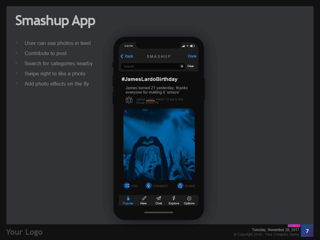
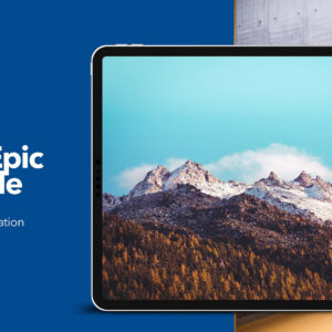
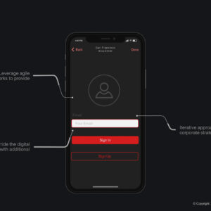
Learn how to design your app Wireframes with the Entrepreneur’s Wireframe Kit – PowerPoint Template (Keynote version also available).
Here are the links to the template files we are going to use:
PowerPoint
Download the FREE PowerPoint Template
Download the FULL PowerPoint Template
Keynote
Download the FREE Keynote Template
Download the FULL Keynote Template
App revenue will reach an estimated $189 Billion by 2020 and more people than ever are getting onto the app bandwagon. App design opens up a blank canvas for every type of business you can imagine.
With such growing demand for apps and games, it has become more important than ever to get to an MVP (Minimal Viable Product) in the shortest time possible.
Draw your own app wireframes
If you are an app designer, you are spoilt for choice when it comes to having the right tools you need to design the perfect app. If you are a developer, it is getting easier and quicker to write beautiful bug-free code. However, if you are an entrepreneur who wants to sell their app idea to investors or get feedback from a developer or designer team, then, you are left to your own devices.
What if – you as the entrepreneur – the original creative mind behind your app could build a wireframe yourself with the tools you are already familiar with.
The Entrepreneur’s Wireframe Kit allows you to get ‘hands-on’ with the UX design of your app using PowerPoint or Keynote.
It was designed to help Entrepreneurs share their app ideas quicker with developers, designers, and investors. Free and Full versions available.
Promotion:
Powered by Creative Market
Terminology
Let’s learn some UX vocabulary first.
If you are about to design your first app, then there are a few words you have to know the meaning of.
-
Wireframe
A Wireframe is a blueprint for your app. It represents a practical and visual demonstration of the UX and will also help you create the scope of your project and assist you and your design team in visualizing your app.
-
UX (User Experience design)
User Experience design is the field of study that deals with the user’s experience of using your app. This field of study ranges from the phycological to the sublime art of engaging with your users.
-
UI (User Interface design)
User Interface design is all about how your app looks. This includes the use of colors, the size of your buttons, the fonts you use and pretty much everything that is visual about your app.
-
Native Design
Native Design is the design guidelines that belongs to that mobile platform. Both iOS (Apple) and Android have their own set of ‘native’ design guidelines.It is generally considered better to have your app designed natively because Apple and Android have their own set of design methodologies.Android’s design methodology is called Material Design and iOS is called iOS.Native Design is also quicker and less buggy because native controls were developed by Apple or Android and all the developer has to do is plug it into your app (more or less :D).
-
Native Controls
Native Design has its own set of Native UI Controls. A Native Control is nothing more than a pre-set button, text field, or a UI item that is unique to that Operating System. Using Native controls to design your app is the recommended solution.
-
Hybrid Design
Hybrid design is the opposite of Native Design. Developers use third party software to create an app that works on both iOS and Android without having to program it twice. Hybrid design will save you money since you do not HAVE to design and develop your app twice (for every mobile platform). This option works well for short-term apps or campaign-related apps but not for an app that is supposed to have a long shelf life.
-
MVP
Minimal Viable Product is a term that is used to create the expectation of what your app will look like and how it will work in the real world. The idea is that you launch quickly with something that has the core value available to your users so that you can test whether your app works and if there is enough demand for your kind of app.
How to design your wireframes in PowerPoint
Now that you have a bit of background let’s get started. For this demonstration, we will be using the full version of our Entrepreneur’s Wireframe Kit (Available Here).
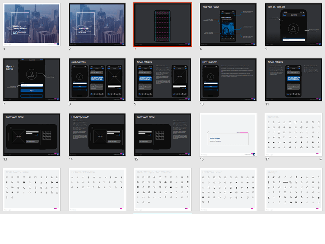
Step 1 – Delete unwanted slides.
Decide on a theme (Zen or Standard) and whether you want to use the dark or the light theme and what aspect ratio (4×3 or 16×9 (widescreen)). Also, decide what platform you want to design the first version of your app on.
In this example, we are going to work with the iPhone X on a 4×3 aspect ratio, and we want to use the dark version of the Zen theme. We can remove all the other slides to reduce the time we spend scrolling up and down. Keep the “Assets and Resources” slides.
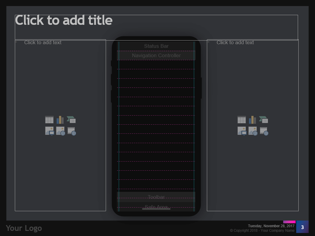
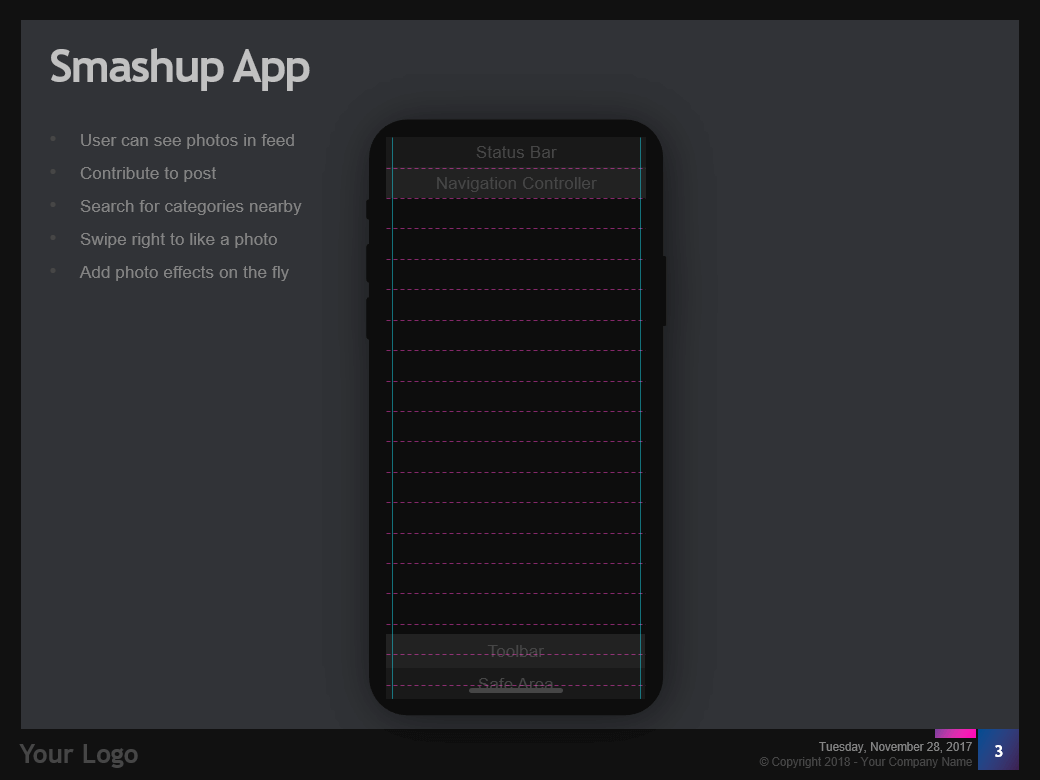
Step 2 – Create a GRID slide using the “iOS Large Grid + Content” – Slide Layout.
This slide allows you to do two things;
- Add the features and specs of that screen.
- Draw UI elements on the screen using the iPhone X grid.
Step 3 – Name the features of your app.
Before we can start drawing UI elements, we need to know what we need to draw. In the bulleted lists on either side of the grid go ahead and name all the features you will need in your app that will be visually represented.
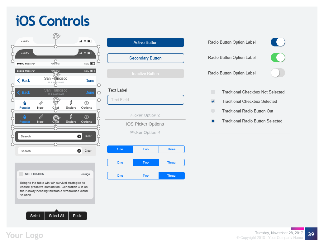
Step 4 – Add the native controls that you need in your app.
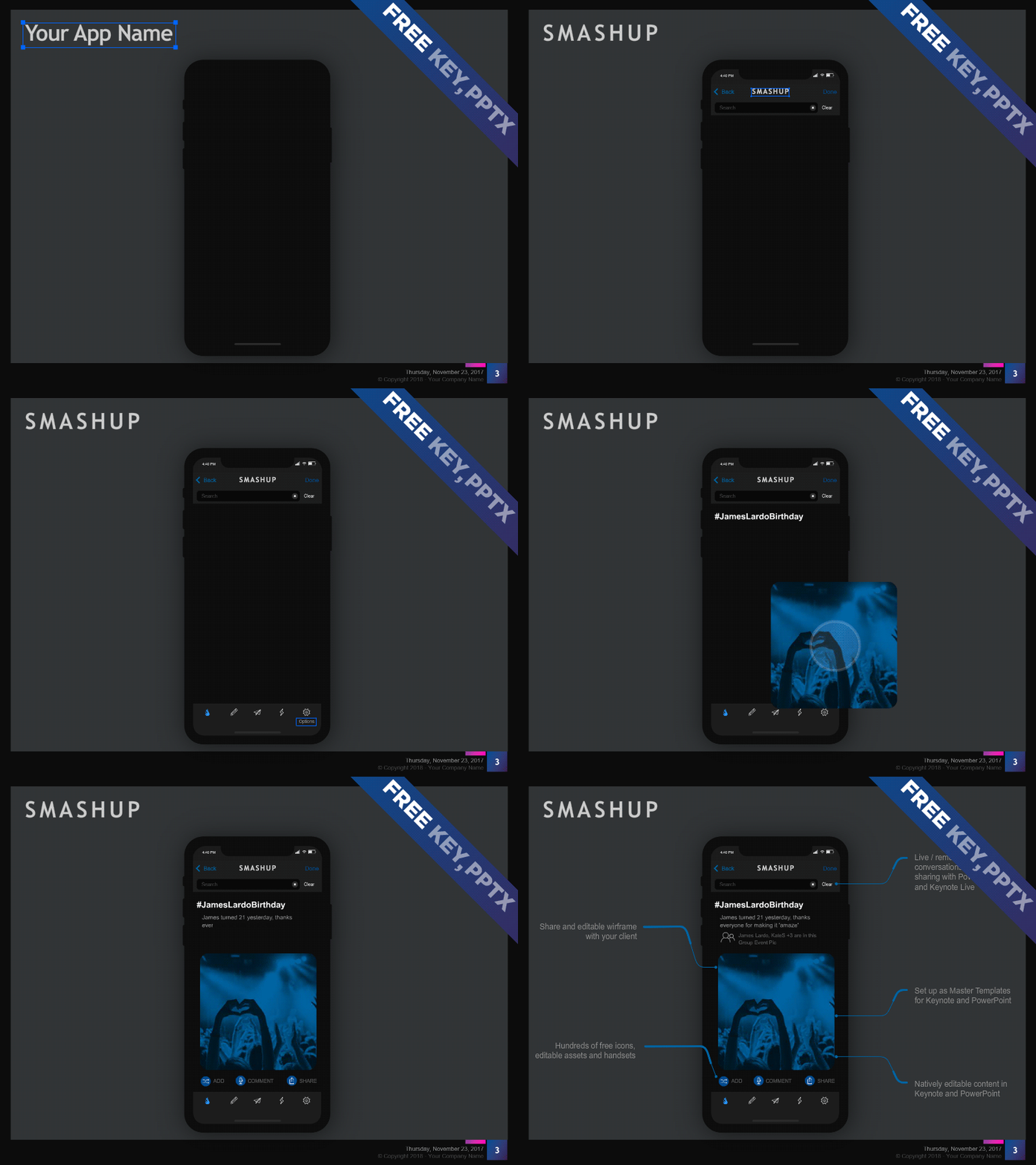
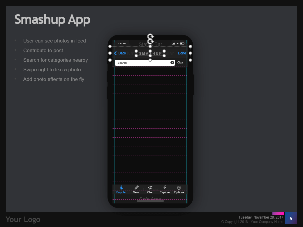
For this example, we add the native iOS tab bar and the native iOS header
Step 5 – Edit the text of the native controls
Change the text by double-clicking on the controls and editing the text.
Step 6 – Change the icons
To change the icons in the “Tab Bar” you need to ungroup the object, delete the icons and find new ones from the icons provided in the template. The Entrepreneur’s Wireframe Kit also come with a variety of native icons for iOS and Material Design.
PRO TIP: Another excellent source for icons is www.thenounproject.com
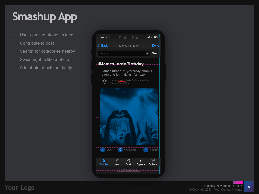
Step 7 – Add the rest of your features.
Finish the design by ‘Copy and Pasting’ from our ‘Native Controls Library’ slides, using icons and or drawing your content and features.
Step 8 – Switch off the grid.
Once you are finished with the design, you can get rid of the grid by changing the layout to something else like “iOS Large Middle + Content”.
Step 9 – Make cosmetic changes and repeat.
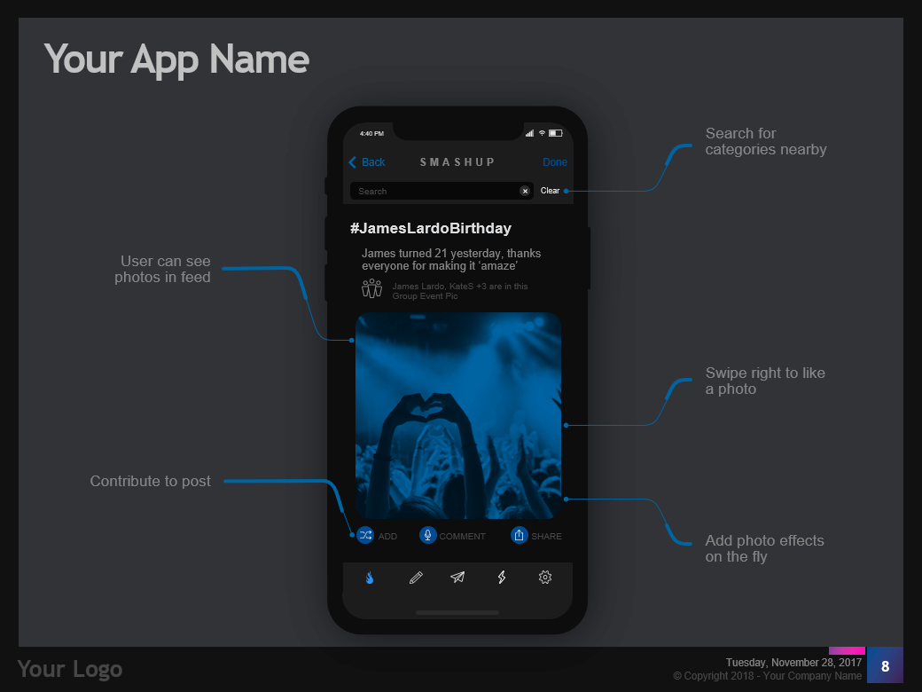
We prefer using the callouts (also provided in the theme) than just listing the features in a bulleted list.
Step 10 – Sharing your designs
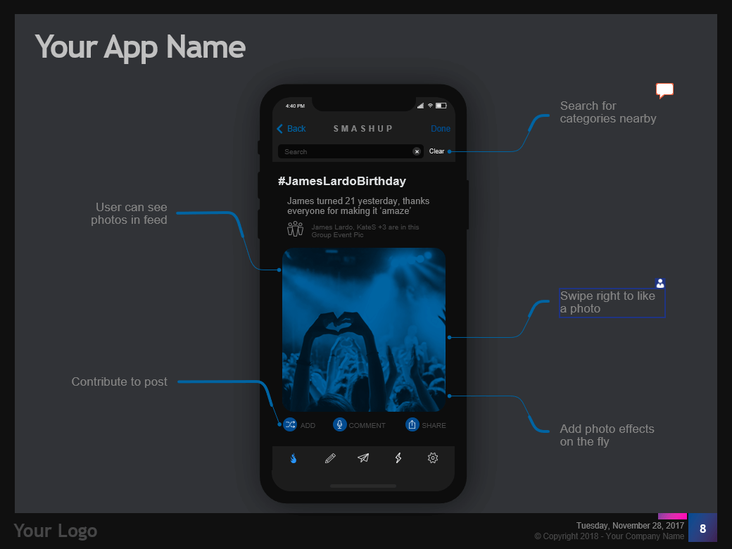
Now you can share your designs with other people using Office’s latest sharing and commenting features just like you would do with any presentation.
We hope you find this template useful and hope to improve it with your feedback. If you have questions, queries or suggestions, please email us [email protected] or comment on this page.
Download Links:
PowerPoint
Download the FREE PowerPoint Version
Download the FULL PowerPoint Version
Keynote
Download the FREE Keynote Version
Download the FULL Keynote Version
Google Slides
On Request, please email [email protected]
Thank you for viewing this article if you want to visit the Entrepreneur’s Wireframe Kit Page – Click here
Looking to take your UX career to the next level?
Visit Jooble to find the ideal UX / UI or software development job.
